Friday 20 June 2008

Preview

I just thought I'd give a quick preview of some of my work before my website goes live! You'll be able to see much much more, I'm still in the process of creating the website, but the moment it is done I shall be announcing it on here!

Hope to see you all back here soon.


Tuesday 26 February 2008

Typographic Cities

I was asked to produce an invitation poster based on the subject "Typographic Cities". As it was part of our typography module (1st year) I had decided to concoct a city of typography in an interesting and un-poster like style. Not every poster should be obvious, attention-grabbing, to-the-point and simple, I wanted to do the opposite, something delicate, detailed and intriguing, and more engaging to the audience. That may look like one thing at the first glance, but something completely different at the second. And so I leave this image for you wonderful people to work out. It is aimed at engaging people and for people who love crosswords or mind-games of that sort.

As a hint, you can try looking for the title "Typographic Cities" and search the streets for something interesting.


As a further note, I'd like to say that the intended place for this would be a tube or a train, as many of my journeys to and fro university consist of me standing squashed like cattle in a tube packed full of people, and with nothing to do but trying to avoid looking at someone intentionally. Engrossed in this poster would be an interesting way to spend that journey.

Thursday 31 January 2008

Andalucia

This is an oil painting titled Andalucia. It's my first painting in oil, painted just a few weeks after my Chopin in Acrylic. Although it was very unusual experience using oil, especially for someone who has only ever played with poster paints and acrylic at school. I must admit I really enjoyed the slow drying process, aside from the fact every time I tried to lift it, and no matter how carefully I did so, my fingers would smudge a bit of the sky or some other part of the painting. I have used medium thick brush strokes to give it a feel of It took around 2 months for this to dry completely, and its only now that I realised that it was because I used the paint straight from the tube and didn't thin it out. I don't mind anyway I prefer the thick texture, it adds drama when it catches the light, I prefer it this way. I hope you concur.


Wednesday 30 January 2008

Frédéric Chopin


Here, I did a painting for my dear friend, who is studying Music at Queen's University in Canada. He admires Frédéric Chopin among many other composers, and so as a present for getting a place at such a prestigious university I decided to do a painting of Chopin (because i knew he would like it so much). You can see the steps that I've taken, from the inital sketch (which didn't look like him at all) to the final stage. It's painted in acrylic and on a spare mdf board I found lurking behind my bed. The aim was to emulate his pain and frail health through his eyes expressions, and through the choice of colours. Composers have such a turbulent life, and his was of no exception.


Friday 4 January 2008

Cross and Crescent


So a few summers ago during the Israeli massacre of Lebanon I became interested in Lebanon and having done research I realised how all religions lived so peacefully together, especially Christians and Muslims, and that really inspired me. Being a Muslim (Sufi) myself, I loved how the two religions were so close and in love. It really goes well with my Sufi thinking, and so therefore, I wanted to design something as interesting as the unity pendant above, this is still an ongoing project.


So my final design so far

Representing the Family

So here's a project from last year, based on representation of information. We joined into a group of 4, and decided to look at how we could represent our level of love for each main member of our family.

It took many days of sketches to work out how to represent certain people. We had to bear in mind that representing something in one way could mean something else in another person's culture.


This is the final key we created, a total of 10 characters.


An extra print out to use as a guide to cut out a prototype on thin acrylic.


This is the final version. It's created as a fan, and each group member is represented using a different colour. We chose to represent our love and closeness to each member by varying the length, i.e the longer it is the closer we are to them. Each person gets 20 characters, one for the father's side and one for the mother's.


The other people in my group included: Hourieh, Sachiko, and Zara.

Friday 7 December 2007

I'm dreaming of a 'colourful' christmas...


..With every Christmas card I design. May your days be merry and bright and may all your Christmases be colourful.... :-)

I know that doesn't work as well as the original song, but I've certainly decided to rewrite it.

And that is because I have good news. I entered a Christmas card competition having found out only a day to go before the deadline, the brief was asking us to design a card that was compatible for people of different languages and of people of different cultures.

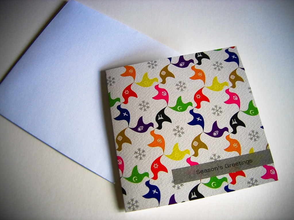
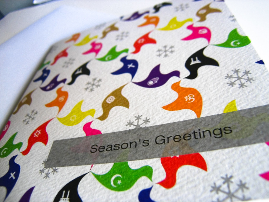
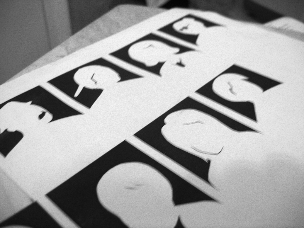
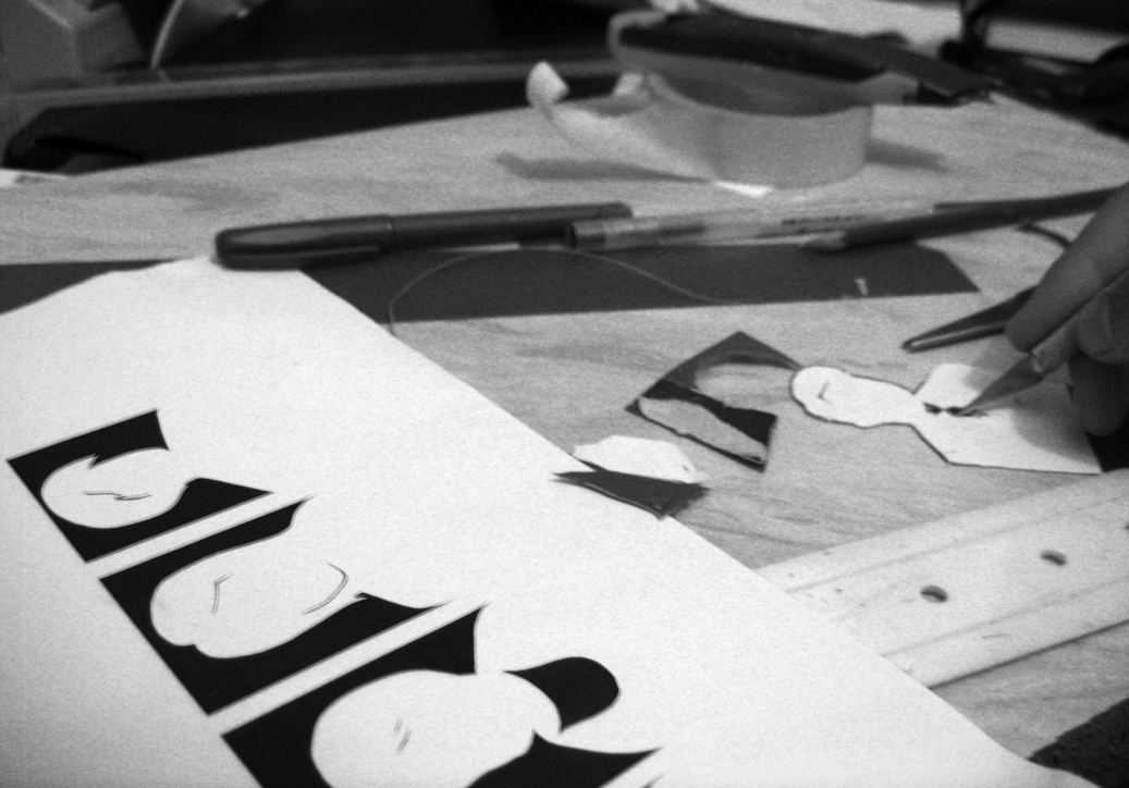
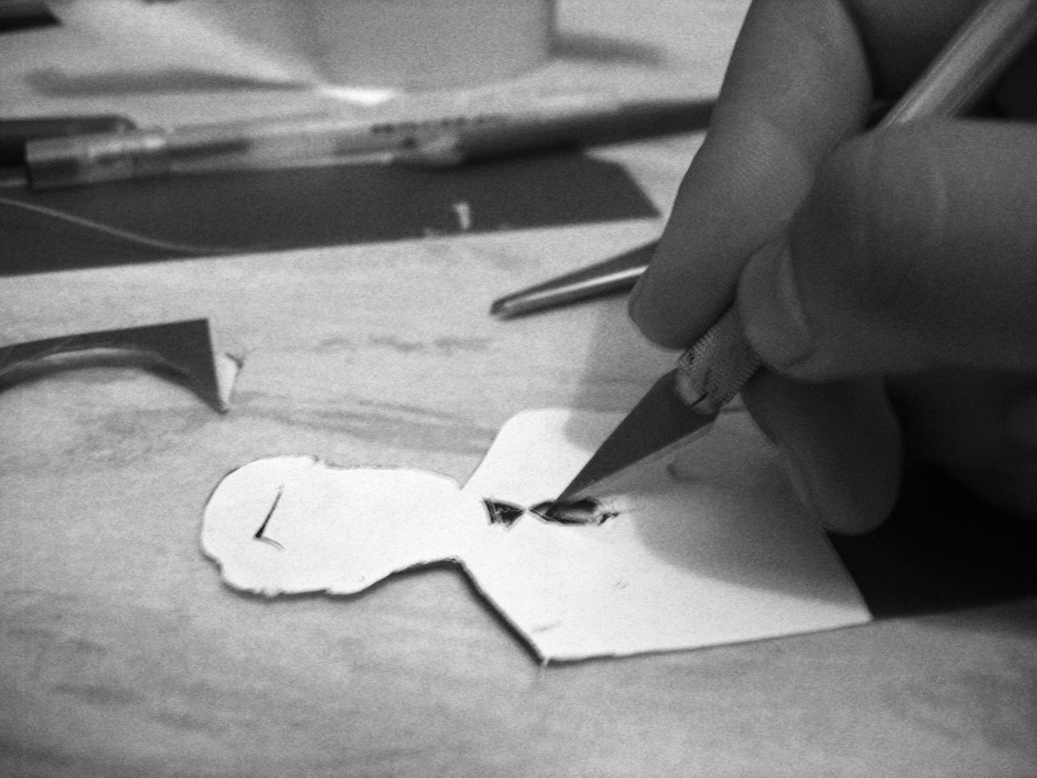
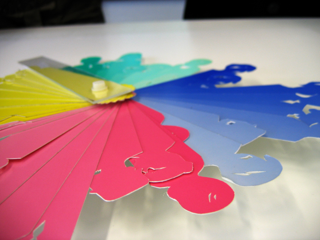
I decided the imagery of a dove as a symbol of peace would be a very iconic thing to use. And chose to do that in a tessellation. of course it suggests a natural, never ending, ongoing peace (exactly what i want)and to bind it all together I chose to change the colour of each doves corresponding to its religious affiliation and therefore putting across a message of peace for everyone at this very festive time of the year.

I hope you like it. The card can be found here. It is the 3rd card on the list.

Here are some of the other quick designs I had submitted.


*Update*

(03.01.08)

So I ordered a few of the cards, and I received them in the post a few days back. I have to admit they do look rather grand in print.